| CHAPTER 2 Motion Console |
|
Object Summary WindowsObject Summary windows display the attributes of individual objects using a grid control, much like a spreadsheet. Each object is represented by a column and the attributes are represented by rows. For some objects, there are so many attributes that they are divided and categorized into several tab windows. The user can configure which objects are to be displayed by an Object Summary.
Configuring Object SummariesSummary windows are configured to display objects directly or by association. For example, the Axis Summary can be configured to display a set of axes, such as Axis 0, Axis 1, and Axis 2, or it can be configured to display all the axes associated with a set of super-objects, such as MS 0, MS 1, and MS 2.
Object Summaries can be configured by using 1) the Object Explorer, or 2) the Object List Configuration dialog box, or 3) the View Sub-objects buttons on another Summary window. See the sections related to these windows for more information. The View Sub-objects buttons are described below.
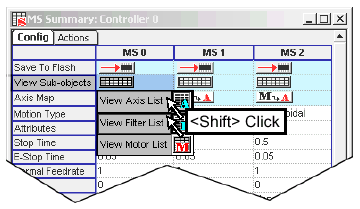
View Sub-ObjectsThe View Sub-objects button is displayed as a general configuration item on most object windows. It is not displayed for DAC and IDN objects because they do not have any sub-objects. A "sub-object" is meant to signify any object that is mapped to another object, either directly or indirectly. The summaries shown are identical to those presented by clicking on summary icons in the Object Explorer. For example, clicking on the View Sub-objects button within the Controller Summary window displays eight types of subordinate objects: 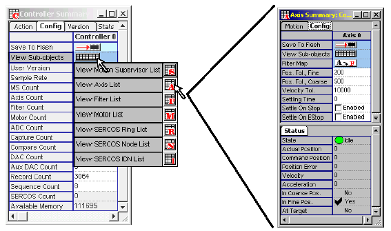
A lower-level object such as the Filter object will display fewer sub-object types: 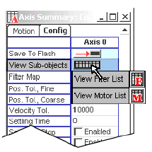
Sub-object summaries are displayed by selecting them with the mouse. More than one summary can be selected from a list by simultaneously holding down the <Shift> key while clicking on both.
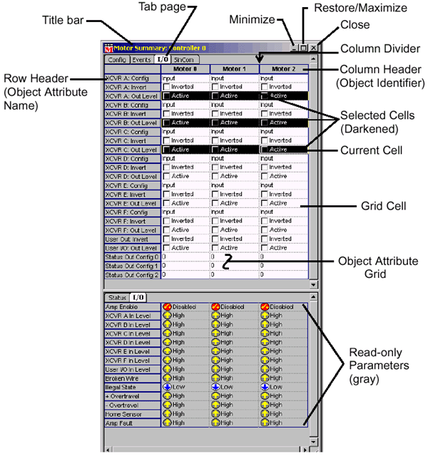
Anatomy of an Object SummaryBelow is a diagram that illustrates the various parts of an Object Summary window.
"Configurable Attributes" versus "Status Parameters"Some summary windows are divided into two sections. The top section of the window lists attributes which may be altered through direct data entry; these are configurable. The bottom section of the window contains read-only information regarding the status of objects; these are not configurable. An example of one such panel (an Axis summary) is shown below. 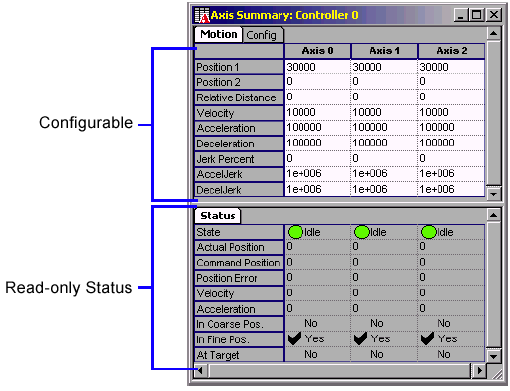
In this example, the bottom, read-only parameters provide status information about the axis; they cannot be manually changed. Attributes in the upper portion of summary windows may be altered by manually entering values.
Cell ControlsEach grid cell contains a user interface control that displays data and, for configurable attributes, allows the user to enter data. Below are shown some controls found within an object grid. 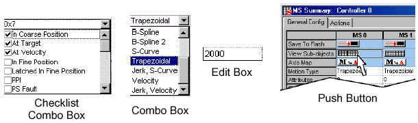
Edit
Box-- Data is entered manually into the cell using the keyboard. Combo
Box-- Clicking on a cell yields a pull-down menu of options,
which can be selected, or data can be manually entered via the
keyboard. Combo boxes consist of two parts: 1) the edit box;
2) a drop-down button. If you choose to type in your selection
manually, you must enter it exactly as shown in the list of
options. Clicking on drop-down button will cause a window to
appear that displays the option list. You may then click on
a selection. If you do not want to use a mouse for entry, type
<Alt><down arrow> to display the choice list and
then use the navigation keys to make a selection. Every control
type has a method for entering data without using the mouse. Checklist Combo Box-- Similar to the regular combo box, except it has selectable check boxes.
Push Buttons-- Clicking on the button will cause an action to be performed on the selected object. If multiple buttons are selected in a row, then the action will be executed on all selected objects. Selecting buttons on multiple rows is not allowed. Buttons can also be activated by selecting the cell containing the button and pressing the Space bar.
Button
Grid-- This is a set of Push Buttons displayed in a grid,
with each button appearing in a separate row. Each individual
button behaves exactly as a regular push button. Multiple buttons
may be selected.
Navigating Within a SummaryMouse-less Navigation within a Summary Window
Tab-- Move the focus to the next control in the window.
Selecting CellsTo select a single cell within the the table, click on the cell. To toggle the selection state of a single cell, hold down the <Ctrl> key while clicking on the cell. To select a range of cells, click on the first cell in the range, then hold down the shift key while clicking on the last cell in the range.
Cells
can also be selected with the keyboard:
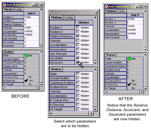
Configure
Grid Rows
| |